My Role
User Research
Prototyping
User Testing
UI Design
Identity Branding
Interaction Design
Tools
Figma
Framer
Adobe Suite
Duration
January 2023
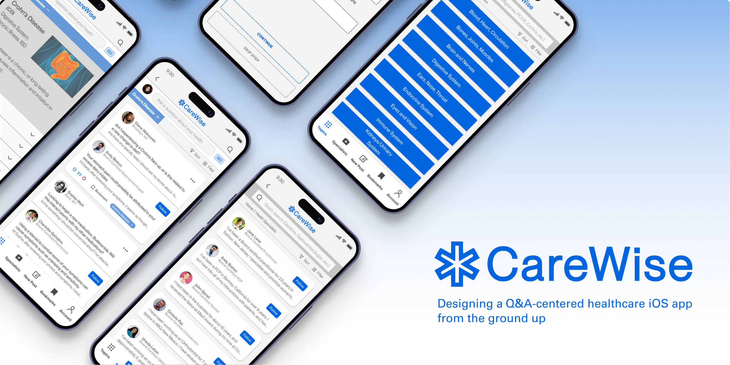
Overview
The idea for the app stems from a common pain point I often encounter when talking to friends and family about medical issues. The problem was easy enough to pin down, many have reached out to me not knowing whether a symptom warranted a pricey visit to a healthcare practitioner- if they even had time in their busy schedule to do so.
As a person with a lengthy medical history and inconsistent access to healthcare, the best support I’ve received has been from local clinics and my community members. At times when I could not ask a friend for advice, turning to google searches and unpredictable forums have often made my medical anxiety worse. This app would connect real users, real experiences and medical professionals to provide validation and support.
BACKGROUND
Research Insights
The strongest assets from these applications include:
• Allowing users to share experiences in their own words
• Allowing certified or verified professionals to interact with users
• The presence of both substantiated evidence and real-life experiences
After some preliminary research, I found that these five apps were the most common platforms that users turn to for general medical advice.
COMPETITIVE ANALYSIS
Despite the countless amounts of fact-based medical applications on the market, a majority of users opt for community-oriented approaches such as Reddit and Quora.
After meeting with six participants to talk about their relationship with healthcare, I found that participants would rather have real experiences with other individuals when dealing with health-related concerns. All participants also desired access to timely, reliable, and substantiated healthcare in lieu of in-person healthcare for minor health concerns, ailments, and support.
ONE-ON-ONE USER INTERVIEWS
After sitting down with my participants, I was able to create a user persona based on two provisional archetypes I recognized during these talks- The Skeptic and The Busy Bee.
Through this, I gained insight into who the target user of this app will be, someone who can usually do their own personal medical research- but is too busy to do so. The user persona would prefer if this job was left to a medical professional but does not have the time to visit one in person very often.
CREATING THE USER PERSONA
After condensing this research into an affinity map, I was able to see that care, trust & privacy, and access were valued the most by my interview participants. To my surprise, the most common obstacle they all had in common was the lack of resources within the parameters of their health insurance plans.
“Being a young adult looking for healthcare, going around the bureaucratic red tape that is insurance- trying to look for healthcare is so exhausting.”
-Sachi, 28
AFFINITY MAPPING
Defining User Pains and Goals
Speed, trust, care, and access were the four major areas of concern exemplified in the affinity map data. Breaking down these points was essential in creating solutions to these common user concerns
User Pain Point: Difficulty establishing consistent relationships with in-network healthcare professionals.
Solution: Engaged interactions with certified medical professionals who prioritize the user.
User Pain Point: Receiving time-sensitive care, whether it be for something mild yet concerning or life-threatening health concerns.
Solution: Actionable solutions in a matter of days, and immediate access to pre-established solutions for similar healthcare concerns.
User Pain Point: Experiencing awful bedside manner after waiting months for an appointment with an in-network healthcare provider.
Solution: Offer anonymity as a privacy option, full transparency, background checks, and a review system for medical professionals.
User Pain Point: Often being too busy to pursue solutions to their persistent healthcare concerns.
Solution: Intuitive information architecture to promote maximum efficiency when seeking specific information.
PRODUCT ROADMAP
These four key task flows illustrate the primary functions of the app;
Creating an account and the onboarding process
Posting a question to medical professionals
Navigating to a question under a specified health topic
Navigating to a medical professional's profile and following them
By mapping out these four key task flows for the user persona, I was able to hash out the essential features and pages that will ultimately help me understand the user journey.
DEFINING KEY TASK FLOWS
Interactive Prototype & User Testing
“Empowering you with expert medical advice, anytime, anywhere.” My focus was to stay true to this phrase as I progressed through the design process.
This resulted in a safe space for individuals dealing with specific health concerns to receive proper assistance from board-certified medical professionals acting as patient advocates.
BUILDING AN INTERACTIVE MVP
Familiarity and comfort as a design focus was my priority during the creation of the app’s assets and brand identity.
My aim was to evoke this through the utilization of familiar forum/post structures commonly seen on Reddit, Facebook, and Quora. I also wanted users to associate the app with certified and substantiated medical care by adapting the calming deep blue and an ambulance symbol in CareWise’s logo.
UI KIT & IDENTITY BRANDING
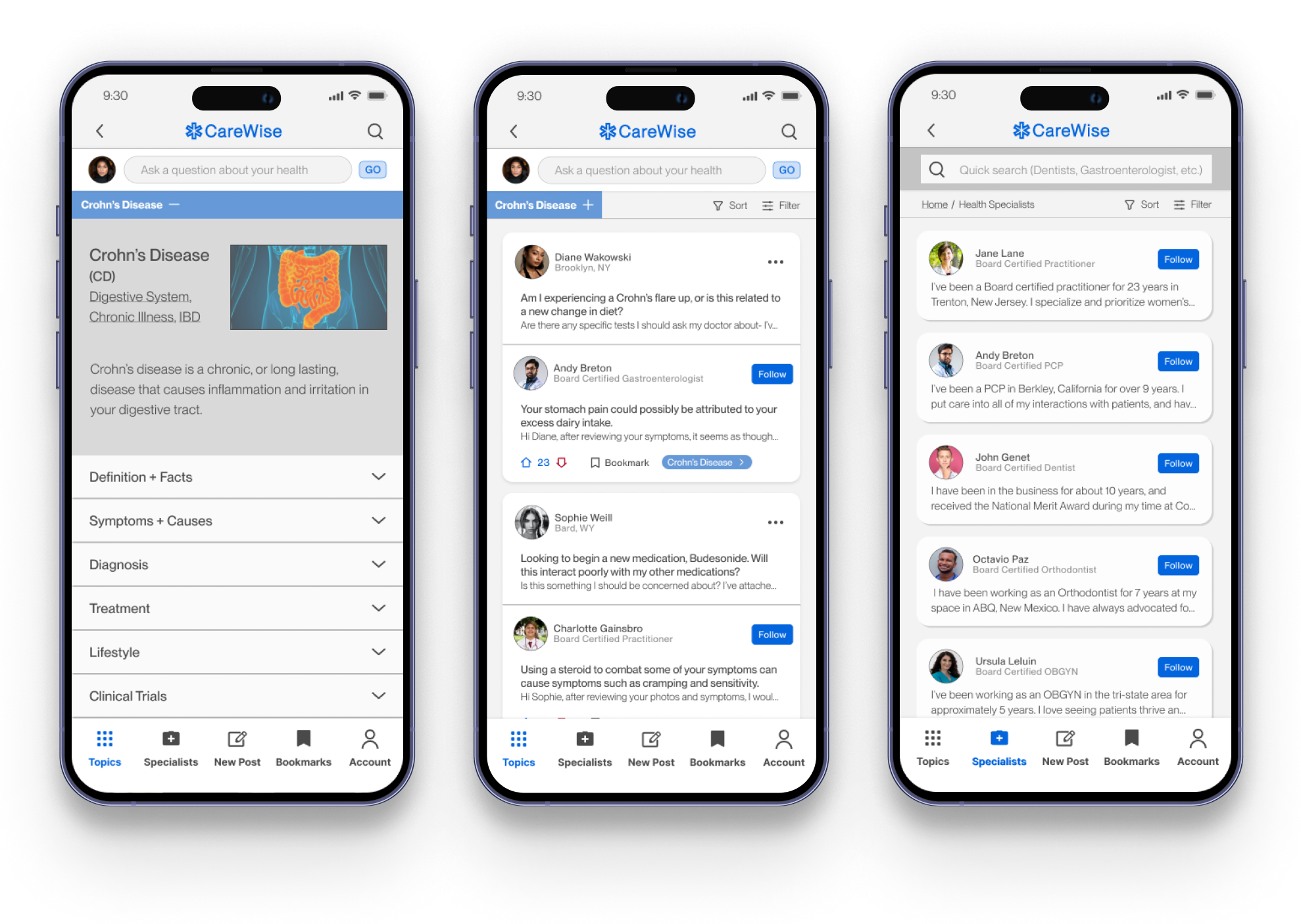
The Final Product
FLOW 02
Creating a Post
The most important aspect of the app was presenting users with a seamless journey when posting questions on the main feed. The ultimate goal was to allow users to post a question in less than three clicks.
FLOW 03
Final Iterations
After I created the User Testing Affinity Map, I was able to pinpoint two major pain points that were present throughout the user testing phase.
USER TESTING & MAKING CHANGES
ITERATION 01
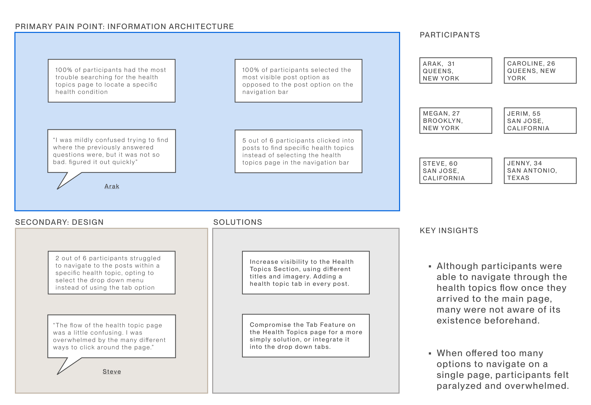
Navigating to a post within a specific health topics
Accessibility was an essential element in creating CareWise’s design architecture. This means creating a clean and intuitive interface with clear navigation to cater to users with different levels of tech proficiency.
Navigating to a specific medical professional and following their activity
One of the most important takeaways from researching target users was how difficult it was to find the “right” health practitioner. To create more connections between users, I presented the option to “follow” the activities of preferred professionals.
Re-formatting “Topics” section
By adjusting the design of the Health Topics section, users are able to decipher between the different sections of the app. After observing that most users already had context for the topics they were researching, I transformed the topic description into a drop down box.
Adding “tags”
ITERATION 01
By adding topic tags within posts, the chance of users discovering different sections of the app increases at a faster rate. This also allows for more movement and accessibility within the app.
FLOW 01