My Role
Product Designer
Tools
Figma, OptimalSort, Whimsical, Maze
User Research
Prototyping
User Testing
UI Design
Identity Branding
Interaction Design
Project Duration
1 month (November 2022)
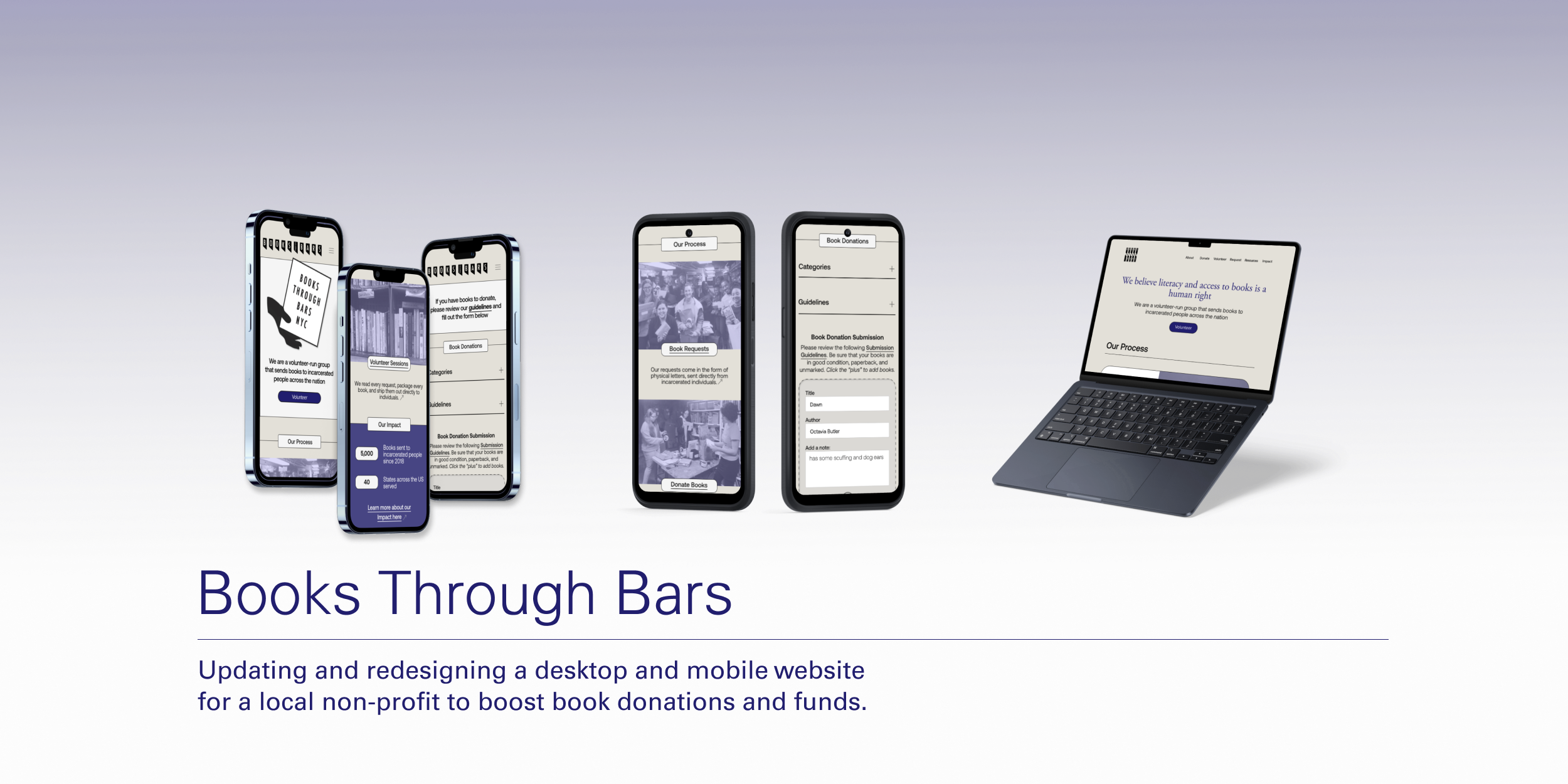
Overview
Books Through Bars is a harm reduction organization in New York City that brings books to incarcerated individuals
Contributors donate their books, funds, and time in order to keep this organization afloat. During COVID-19, this branch of Books Through Bars was forced to shut its doors temporarily, limiting access for volunteers - thus slowing down the momentum for the organization.
Research Insights
By examining the strengths and weaknesses of these sites, I learned that an impactful call to action, accessibility, and efficient communication forms are among the most significant factors of a successful non-profit website.
A strong landing page, hero/splash page and CTA create engaging experiences
Information-dense sites need links throughout each page
A majority of the sites possess a limited amount of pages
Generic contact forms create too many unorganized inquiries
Websites with more statistics, testimonials, and photos offered more credibility
COMPETITIVE ANALYSIS
“Most of our volunteers just want an easy and clear-cut way to help spread the joy of the hobbies they are passionate about.” Shannon, 35
“ Working with mutual aid groups who work hand-to-hand with their community and seeing the impact directly was amazing.” Sachi, 27
USER INTERVIEWS & AFFINITY MAPPING
Delilah's main goal is to connect with her new community by volunteering at BTB during her spare time.
To further understand the user goals of the average BTB contributor, I created a User Persona based on an accumulation of all my research.
CREATING THE USER PERSONA
After condensing this research into an affinity map, I was able to see that efficient communication, convenience, and ethos of the non-profit were the most valuable assets for these interview participants. To my surprise, the most common obstacle they all had in common was the lack of communication between the volunteers and the organizations. Many of the participants cited that they will abandon their desire to volunteer if there are too many hurdles in their way.
Defining User Pains and Goals
The diagram illustrates the need for the following features:
An engaging landing page, hero, and CTA
Utilizing the influx of new community members post-pandemic
Bringing in more book donations & volunteers
In order to decide which features to focus on, I created a diagram to identify user goals (desirability), business goals (viability), and technical/product goals (feasibility).
PROJECT GOALS
I came to the conclusion that two key task flows needed to be present within the MVP of the Books Through Bars design; Signing up to volunteer and making a book donation to the organization.
By mapping out these four key task flows for the user persona, I was able to see that the home, volunteer, and donate pages were key to a successful user experience.
TASK & USER JOURNEY FLOWS
Interactive Prototype & User Testing
I asked 5 participants from the ages of 26-36 to complete a series of tasks using my BTB prototype VS. the original site:
Donate two books to the organization. Navigate to the desired page and complete this task.
Volunteer your time at a book packing session on your day off, Sunday. Navigate to the desired page and begin this task.
With this prototype, I was able to conduct five usability test sessions and post-test interviews. I was then able to make adjustments based on users' feedback using an affinity map and a prioritization matrix.
BUILDING AN INTERACTIVE MVP
The Final Product
Final Iterations
Insight:
Many users chose to “Learn More” about the site before completing their book donation task.
Opportunity:
Focus more on the prominence of “Book” donations as opposed to funds. Adding a PayPal donate widget to satisfy the needs of those looking to donate money. Placing the “Donate Books” Button on a higher rung of the hierarchy.
RECOGNIZING & IPLEMENTING ADJUSTMENTS
Volunteering for a book packing session
Donating two books to the organization
Why focus on this user?
During COVID-19, many people found themselves wanting to help rebuild their community but had no idea where to start. Though the pandemic created an opportunity to attract new volunteers and contributors, those new to volunteer work were aimless due to outdated, unmaintained websites.
The affinity map allowed me to identify key features in order to create a successful user experience through the Home page, Donate page, and Volunteer page.
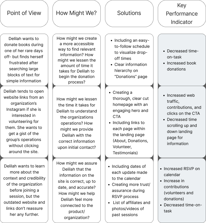
How might we create a more accessible way to find relevant information?
Clear information hierarchy and straight-forward & updated calendar/scheduling
How might we decrease the time it takes for Delilah to understand the organization’s operations?
Creating a thorough, clear-cut homepage with an engaging hero and CTA
How might we help Delilah feel more connected to the product and non-profit organization?
Creating more trust/assurance during the RSVP process
HOW MIGHT WE?
Insight:
Users had an easy time RSVPing to volunteer sessions and often chose to click the volunteer button on the CTA.
Opportunity:
Sending more leads to the RSVP Volunteer page. Beginning the task on an About Me or testimonials page during testing, since most volunteers review those prior to volunteering with unfamiliar organizations
Insight:
When prompted to donate books, users gravitated towards buttons on the CTA that led elsewhere.
Opportunity:
Creating a clear hierarchy of buttons on the landing page, in order to make volunteering the most prominent task at hand
KPI HIGHLIGHTS
With the assistance of KPI's, I was able to measure the success rate of each feature through data from the usability testing.
Based on these Key Performance Indicators and metrics for success, the usability test yielded positive outcomes overall, specifically in decreasing time-on-task and increasing volunteer RSVPS made on the site
Decreased time-on-task when completing a volunteering RSVP, from the landing page
Original Site: 3-5 minutes
Redesigned Site: 0-2 minutes
Increased contributions
Original Site: 20% of users said they would send a volunteer RSVP through this website
Redesigned Site: 80% of users said they would purchase through the website based on the redesigned prototype (the remainder needed more information)
Original Site: 50% of users said they would send a book donation request through this website
Redesigned Site: 100% of users said they would purchase through the website based on the redesigned prototype